Design systems — make the journey solid.

One well-made screen saves a single campaign, but a well-designed design system becomes an operational asset that lasts ten years. The faster the era of building, the more maintenance is paralyzed six months later without a system to bind it together.
What exactly does a design system mean?
A design system is not merely a collection of components. It is a convention that gathers design decisions into one place as code and documentation, so that many screens and many teams reference the same source. In other words, it is not the work of drawing screens, but the work of writing the rules for drawing them.
Atomic Design, published by Brad Frost in 2013, first gave this field a common language. Since then, large-scale systems such as IBM Carbon, Shopify Polaris, Material Design, and Apple HIG have been built on the same principles.
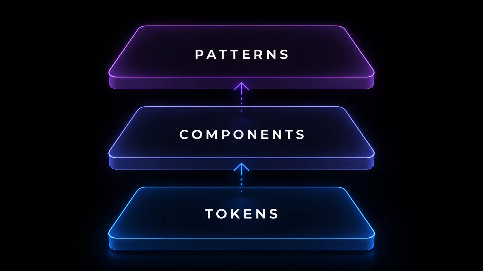
The three layers that make up a design system
A well-run system is usually organized into three layers.
- Design tokens — The smallest atomic values, such as color, typography, spacing, and shadow. The CSS variables in code and the style variables in design share the same source.
- Components — Reusable units that combine tokens, such as buttons, inputs, and cards. When every screen calls the same component, consistency is maintained automatically.
- Patterns & guidelines — The conventions for how to combine components and in what situations to use them. Without this layer, you get different results every time even when the components exist.
The effect of adoption — what gets faster and what gets reduced
The effect of adopting a design system cannot be reduced to a single KPI, but in well-run cases the following changes are commonly observed.
- Shorter time to build new screens — As the work shifts to assembling components, the time to build the same screen drops sharply.
- Lower cost of maintaining consistency — Change one token and it is reflected across all screens automatically. The work of redefining colors for each campaign disappears.
- Lower onboarding cost — New designers and developers can learn the source of code and design in one place.
- Guaranteed accessibility & responsiveness — Accessibility and responsive handling solved once at the component level apply automatically to every screen.
Where should you start?
Try to build a perfect system from the start and you won't finish even one screen in six months. The following order is fastest.
- Define tokens first — Fix the 8–12 most-used colors, 5–7 font scales, and 6–8 spacing values as variables in both code and design first.
- 5–7 core components — Start with what is used on every page, such as buttons, inputs, cards, navigation, and modals. Don't build 30 at once.
- Validate on real pages — Right after building components, rebuild one or two real screens with them. Shortcomings surface immediately.
- Documentation & guidelines — Once components are stable, record the usage conventions as documentation. Without docs, the system exists only in someone's head and then disappears.
- Governance — Decide who can change tokens and how proposals for new components are received. A system is a living asset, so it needs operating conventions.
References
- Brad Frost — Atomic Design (2013, free online) — atomicdesign.bradfrost.com
- Google — Material Design guide — m3.material.io
- IBM — Carbon Design System — carbondesignsystem.com
- Shopify — Polaris Design System — polaris.shopify.com
We build the system through to operation, with you
The concern we hear most often when we start design-system work is "we built it, but nobody uses it." A system is not the work of building, but the work of operating. We design everything from token definitions to governance procedures together, and help the system come alive inside the client's team. We design a system that remains an asset six months later, that way from the very start.